Revolut Ultra
Problem
Titanium's defining quality - its cold density, brushed grain and machined precision - collapses in static photography. Premium materials need motion to reveal themselves. Most product visuals treat the Ultra card as a shape; the material becomes an afterthought.
Solution
An animation led entirely by light. A single beam travels across the card's surface, uncovering every micro-detail frame by frame - grain direction, edge radii, surface reflectance - until the material feels touchable rather than photographed.
My involvement
End-to-end and self-initiated. 3D modelling, material authoring, lighting design, animation and final render. No brief, no client - a personal study in making cold metal feel covetable.
Type
Self-initiated
Year
2026
Research & Rationale
Titanium sits at the top of Revolut's card hierarchy precisely because of its material character - weight, texture, a quiet resistance to light that cheaper materials fake with chrome plating. The Ultra card is defined by what you feel before you see it.
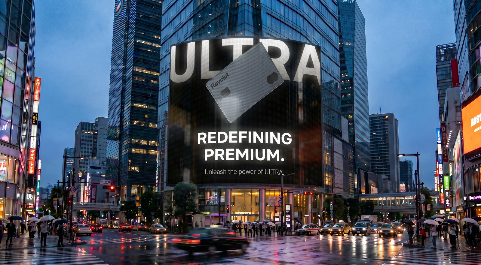
The animation was built to scale. From a phone screen to a city billboard, the material had to hold its premium character at any size. That meant obsessing over the rendering at the macro level - grain, edge geometry, surface reflectance - so that when scaled up, every detail that justified the price was right there in the frame.
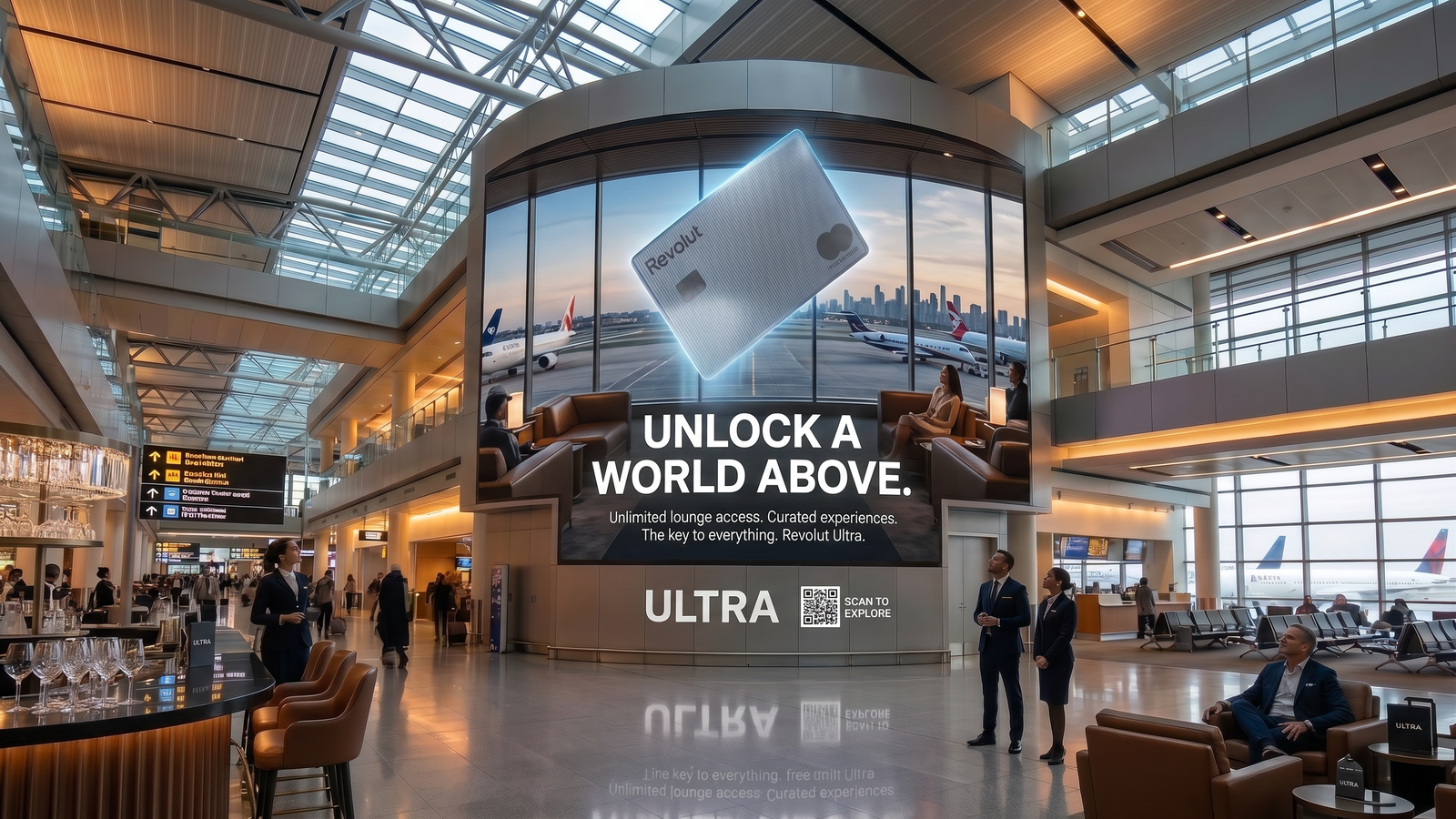
In its element
The Ultra card belongs in airport lounges. It is a card defined by access - the kind of spaces where titanium doesn't need explaining, where the person holding it already understands what it means.
Placing the animation in this environment was the final test. Not a studio render against a clean backdrop, but the card in the room it was made for - warm light overhead, the quiet hum of a departure board somewhere nearby, a window full of runway. The material holds. It was always going to.