Oura Ceramic Ring
Problem
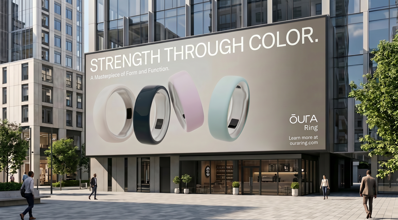
Ceramic rings are sold on colour, but most product visuals treat them like metal - high contrast lighting, hard specular highlights, deep shadows. That approach kills exactly what makes ceramic beautiful: its softness, its matte warmth, the way it absorbs light rather than bounces it back.
Solution
Diffuse, colour-forward lighting that puts the pastel palette at the centre. The camera turns the ring slowly while the light stays almost still - so colour shifts are driven by angle, not by dramatic spotlights. The material does the work.
My involvement
End-to-end and self-initiated. 3D modelling, ceramic material authoring, lighting design, animation and final render. The brief was simple: make the colour the protagonist.
Type
Self-initiated
Year
2026
Research & Rationale
The Ceramic collection exists for its colour. Oura's pastels are the product line's entire identity. The ring itself is a quiet object: no branding on the surface, no sharp geometry. It asks to be seen through its finish alone.
Every visual decision responds to that. Keep the light diffuse and ambient. Let the surface stay fully matte. Slow the animation down so each colour has time to settle and shift rather than flash past. The goal was something that felt less like a commercial and more like holding the object in your hand near a window.
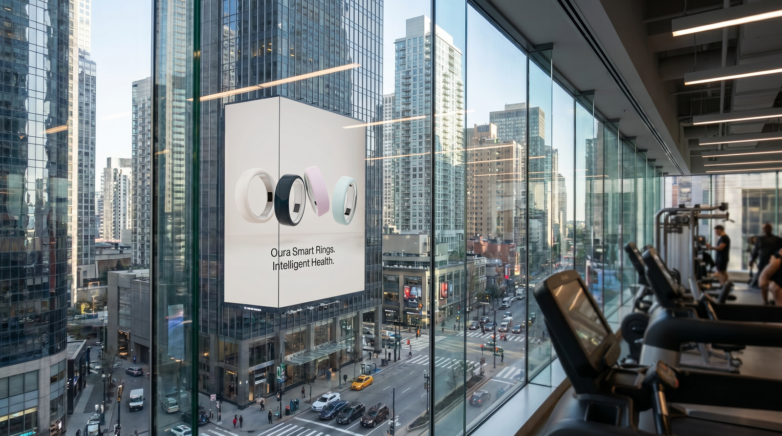
In its element
The ring is a personal object - worn against skin, chosen for how it makes you feel rather than how it performs. That intimacy had to carry through to the final frames. Not a product on a plinth, but something you'd want to reach for.
Placed in context, the pastel palette earns its place. The ceramics don't shout. They sit quietly and let the colour do what colour does best - shift the mood of everything around them.